DASHBOARD User Interface
The dashboard overview shows publicly accessible dashboards. Login to create, edit and share your own dashboard.
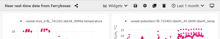
A dashboard header contains several options to interact and build a custom dashboards. Next to the title of a dashboard, the button copies the link to the dashboard and can be shared with colleagues. Widgets build a dashboard providing plots and other visualizations.
Following buttons are available
- saves the current configuration of the dashboard
- cog opens a dialog to customize the dashboard
- clone makes a copy of the current dashboard
- remove deletes the current dashboard
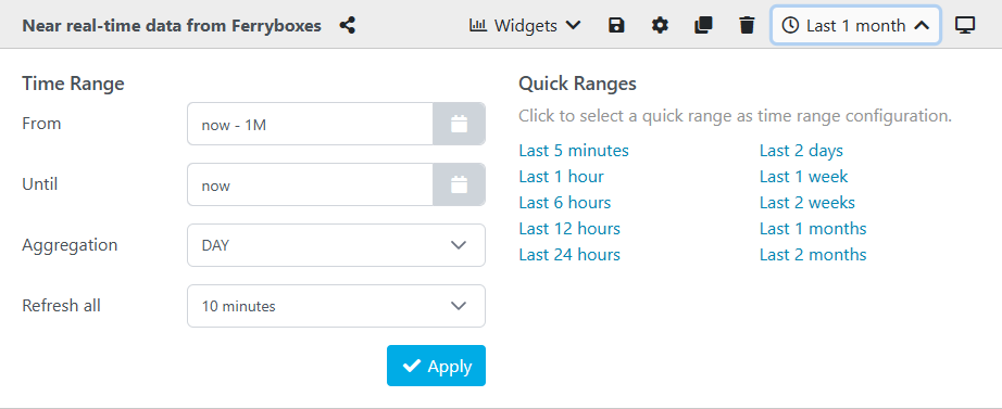
- clock opens a time ranges menu, to adjust data visualizations in widgets
- kiosk-mode is your dashboard without the sidebar and header. This is a good mode to be integrated at other pages via iframes.
Time Ranges
The dashboard supports adjusting time ranges. Use the left "time ranges" inputs to tweak the visualized time ranges in details. Use the right "quick ranges" as shortcut to frequently used range settings.
Customization Dialog
The basic configuration of a dashboard is set in the custom dialog. It comprises following settings.
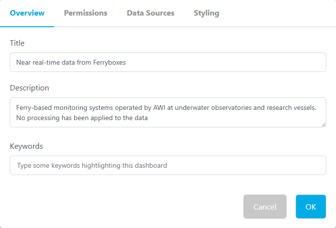
Overview is to set the title and a description for the dashboard. Additionally, keywords can be added. This is a nice feature to query dashboards for a certain topic.
Permissions can be set to make a dashboard is publicly accessible or defines colleagues by email address to share this dashboard with.
Data Sources allow to define additional data sources. By default a dashboard uses data streams from O2A INGEST. But also CSV and TAB delimited files are supported by URL, e.g. provided by PANGAEA. Also standardized SensorThings API STA endpoints are supported.
Styling enables to customize the colors of the widget borders, as well as the dashboard's and widget's background can be set by entering hex color codes (color-hex.org/).
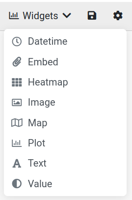
Widgets
There are several widget types to choose from.
Adjust the size of a tile by grabbing the bottom right corner where the arrows appear. Remove a widget by clicking the x in the top right corner. The gearwheel in the top right corner brings you to the settings of the chosen widget. Hover your courser over the top edge of a widget until the four-way-arrow appears, then drag and drop to move the widget around your dashboard.
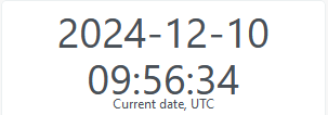
Datetime
Displays the current date and time (UTC) in the following format: yyyy-mm-dd hh:mm:ss
Embed
Allows you to link to a source. In the settings, choose a title to be displayed when the courser is hovered over the content. Add a description and source link to the content you want to display. If you link a website you will be able to scroll within the widget.
Heatmap
Plots a heatmap based on two given parameters. Open the settings to enter a title to be displayed when the courser is hovered over the widget and add a description. Go to the tab X Axis to add a label to the axis. The same goes for the y Axis, but here you also choose the parameter to be displayed. If you are choosing from the dws it is easiest to use the parameter URN (e.g. vessel:heincke:tsg:salinity). Add Data Sources in the global settings of your dashboard to have those available to choose from here. Choose what parameter to display as the z Axis. Under Plot select between heatmap and contour as the plot type. Next is the data configuration. These settings are optional and will override the overall configuration of the dashboard.
Image
Shows a static image or image streams. Images are updated in frequence given in the time ranges menu.
In the settings choose a title, description, link to the image source, and how you want the object to fit when you adjust the widget size. The available options are:
contain, preserve ratio: displays white space around the imagecover, preserve ratio: makes the image cover the entire widget, cropping it as the tile is adjustedfill: fills the entire widget with the image, distorting it as you adjust the size
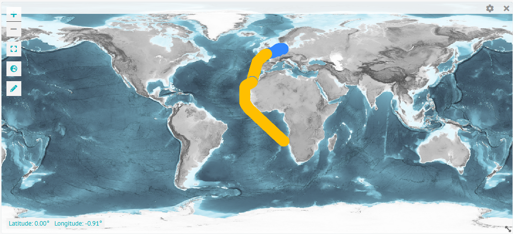
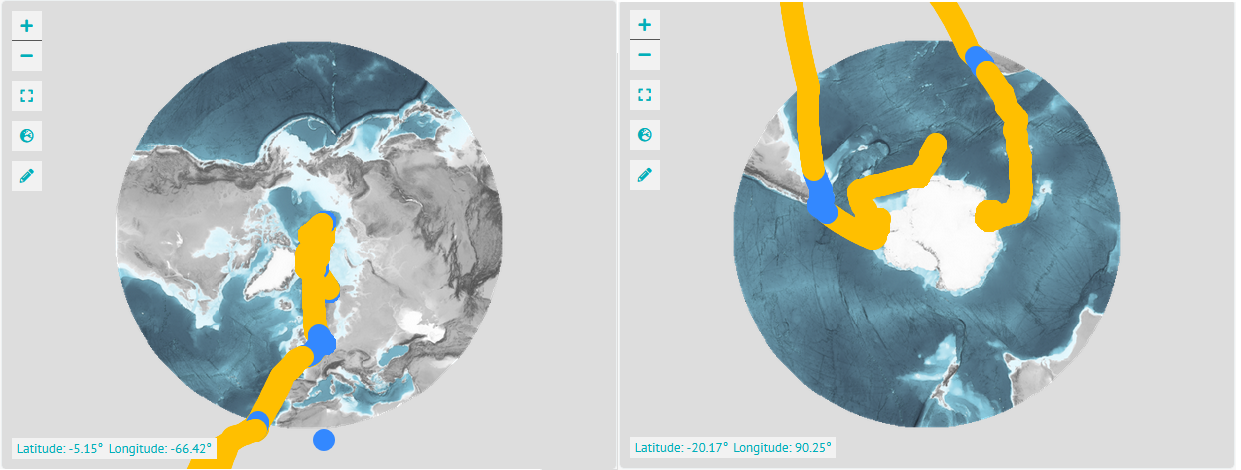
Map
Displays a world map. Hovering over it shows the latitude and longitude in the bottom left corner of the courser position. Zoom in and out using the minus and plus symbols. The frame symbol below resets to a full world view. Click the globe icon to choose between a global, arctic, and antarctic view. The pencil icon opens the options to draw a line, point, polygon, or rectangle.
In the settings choose a title, description, and between different base maps. In the Parameters tab add optional parameters from your data sources to be displayed on the map.
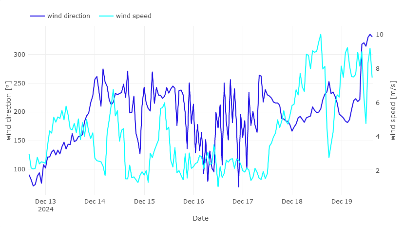
Plot
Plots time series data. In the settings choose a title and description. Give the x-axis a label and choose its parameter. Label the first (left) y-axis, choose (several) parameters by clicking "+ add a parameter", then picking a colour, label and data source. Optionally, do the same for the second (right) y-axis. Under plot select between the following plot types:
barboxline(default)scatter
Picking a begin and end date in a plot's settings will override any time frame that is otherwise chosen by a user in the time ranges menu. Aggregation and limit are settings that involve how the data is downloaded from the data service.
Here is an example plot with two y-axis showing wind direction and wind speed measured on the vessel Heincke.
Text
Displays a custom rich text to describe the content of the dashboard or other widgets. Under content in the settings add a title and content of the text you want to display. The editor allows many formatting and styling options. This includes but is not limited to: different headings, align options, lists, links, images, videos, and tables. Add padding to the outside of your text field in the styling tab, or even a different background colour.
Value
With the value widget you can display a single parameter value. Pick a title, description, what parameter to display and with how many decimals it should be displayed.